Next year is a major inflection point for the Internet. We should begin to see mobile Internet users surpass desktop Internet users, according to the venerable Mary Meeker—the “Queen of the Net” and a partner at Kleiner Perkins. More people are becoming mobile-only or mobile mostly. Businesses face new challenges because of this mobile behavior. Whether it’s shopping for shoes while watching your kids on the playground or checking your email, then reading a long-form article while lounging on the couch, consumers expect content to be relevant and the experience intact. On a recent customer research project at Hot, we heard that some people won’t even do business with a company lacking a mobile-friendly site. A mobile strategy is becoming a part—if not essential piece—of every web project.
There is a lot of debate on whether responsive web design is the right strategy or not. At Hot, the question is whether or not responsive design is the right strategy for your organization. The answer depends first and foremost on your users and what devices they are using now or are likely to use in the future. Do you need to support feature phones and smart phones? Which smart phones? Small tablets as well as larger tablets? From this you can create a list of devices to support.
Three main approaches to mobile
Once you have a list of devices, your next decision is your mobile strategy. There are three main approaches—and myriad combinations and variations of those three choices. First, you could build a bunch of native applications for specific mobile devices (iPhone, iPad, Android phones, etc.) Second, you could build a separate mobile site in HTML (a m. site or a .mobi site). Third, you could build a universal responsive site in HTML. Initially, a responsive design meant that the page itself would respond to the device on which it’s viewed by showing a different layout. However, there have been refinements to the approach in which you create a page with server calls that will send different content and functionality.
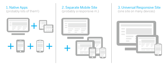
Then, of course, there are combinations and variations. Many companies, like Facebook and Yelp, decide to support both HTML sites and native apps. Some, likePeople.com, will build a separate mobile site but make it responsive to different screen sizes for phones and smaller tablets. Starbucks designed a universal responsive site for phones, tablets, and desktops.
So how do you decide which is the right option? Below are seven considerations for your mobile strategy.
1. Content parity
Let’s say you’ve decided to offer all (or most) of your content on mobile phones, tablets, and desktops. This is common for news sites, but also mandated for .govs in President Obama’s digital government initiative. Looking at Obama’s own mobile site for re-election, you see complete content parity and a responsive design. However, some of the mobile pages are overloaded and very long. (For a screenshot, see the great article by Brad Frost comparing the Obama mobile site to the Romney mobile site.) Romney’s separate mobile site has only a fraction of the content. This is common for separate mobile sites because it is difficult to maintain two different sets of content.
Karen McGrane, content strategist extraordinaire, describes a vision of a content management system (CMS) that will eliminate this problem. The idea is to have a CMS with structured content that will serve the appropriate content to different templates for different devices. The key is to structure the content and separate it from the design. This is NPR’s approach which they call COPE, Create Once Publish Everywhere. So how does the consideration of content parity guide your build options?
- Native Apps: great if you have a single content feed through an API or a CMS
- Separate Mobile Site: great as long as you have a single source of content (as this isn’t often the case, you’ll probably end up maintaining two sets of content
- Universal Responsive Site: great, but be aware of the time it takes to load the page for mobile
2. Sharing and SEO
Many projects depend on a social strategy of sharing content, or search engines to provide links to your content. If your users are linking to your content from a side door, such as Facebook or Google, they will want to see the content immediately without downloading an app. Peter Yared at CBS Interactive does a great job of explaining how web traffic drives the decision of developing HTML sites or native apps, or both. If most of the traffic comes from side door links, the solution is to build in HTML. If most of the traffic is frequent and direct, meaning the user entered the home url, then the folks at CBS Interactive build native apps. If the traffic is 50/50, they do both.
For HTML sites, if a desktop user clicks on a shared link, you want them to see the correct version of the page, not a skinny page floating on the desktop. Building a responsive site is a simple solution because it avoids managing a number of different versions of page redirects. However, it is not the only solution. You could make sure you have the proper redirects so users get the right version of the site. We sum it up below.
- Native Apps: only good for sharing within a product (like Pinterest); not good for SEO
- Separate Mobile Site: good as long as you manage redirects
- Universal Responsive Site: the simplest solution (and the one recommended by Google)
3. Creating a rich, interactive experience
If your site is more about productivity or creativity than content, then it might make sense to build a native app to take advantage of the capabilities of mobile devices. Hot has created some beautiful apps that allow you to snap photos and share experiences. As HTML5 becomes more common, there are more and more features available to make rich and interactive experiences. Keep in mind that one of the main problems with the HTML5 platform is in the management of scrolling. If the page is not a single scrollable entity—if you also want to swipe from side-to-side or drag, for example—then scrolling becomes problematic. You wind up reinventing scrolling, which consumes a lot of memory and never really feels quite “native.”
If you don’t need these capabilities, it might be best to build an HTML site with a separate mobile site since this allows you to design for a full web page without having to size it down (or start with mobile first and add on). It’s tricky to evaluate because there are some visually rich sites that have managed to do this within a responsive framework. Here’s the evaluation.
- Native Apps: excellent
- Separate Mobile Site: good to excellent
- Universal Responsive Site: can be limiting
4. Optimizing for presentation
Even if your site is simple, you might want to optimize the presentation of content for each device. Starbucks is a good example of a site that was recently redesigned to be responsive. I can check my card balance or purchase a gift card, all in a responsive design. When users go to the Starbucks site on a mobile phone, the store locator page is location-aware. However, the site doesn’t feel quite optimal on either the desktop version or the phone version. The Starbucks Gift Card page on a desktop has a slightly awkward layout. It works. I could buy a gift card pretty easily, but the layout doesn’t take advantage of the desktop page. Similarly, the mobile site feels a little awkward. In building a responsive site, Starbucks sacrificed an optimized experience. As our engineers here at Hot say, “If you want to build a responsive site, you’ll need to make some hard choices.” So what’s the analysis?
- Native Apps: great
- Separate Mobile Site: great
- Universal Responsive Site: can require hard choices
5. Optimizing for performance
Performance is a big part of a user’s experience. Some sites dynamically serve different HTML pages for different devices just to shave a few KB. In the analysis of the campaign mobile sites mentioned previously, Obama takes a big hit with the file size of his responsive pages. Bill Fisher, a senior design engineer here at Hot says, “They could have built that page differently and achieved better performance, but it would have been more complicated. It might need to load with only part of the content and get the rest afterward with Ajax. With responsively-designed sites, performance awareness has to be part of the design process, and complexity can easily increase.”
- Native Apps: great
- Separate Mobile Site: great
- Universal Responsive Site: potentially more complicated to build for performance
6. Time and resources
If your main goal is to be efficient with your time and resources, it makes sense to avoid building and maintaining multiple apps for different devices. As I’ve written earlier, Steve Pinches from the Financial Times stated, “Developing multiple ‘native’ apps for various products is logistically and financially unmanageable.” The Financial Times bet big on HTML and retired their native apps. It allows them to maintain one code base and manage one editorial flow (and bypass Apple’s cut).
The question then becomes: Is it more efficient to build a separate mobile site or a responsive site? There has been a lot of debate here at Hot comparing the costs of design, build, and maintenance. Taking design first, it can take more effort to design a responsive site since it requires prototyping during the design phase, and the design itself is more complicated. As for build, because a lot depends on the back-end architecture, let’s narrow it down to just front-end development. It takes more effort to code a responsive site. We can all agree that it is probably easier to maintain a single responsive site since it’s one set of code and one content source.
- Native Apps: the least efficient for build and maintenance
- Separate Mobile Site: initially it might be less effort to design and build, but it will probably require more maintenance
- Universal Responsive Site: potentially the most efficient to maintain, but may take more time to design and build
7. Future-friendly
Given the current range of devices, and with new ones being developed all the time, it makes sense to build in a way that your site will work reasonably well on new devices. Building a responsive site is one way to think about building for the future. If you can afford to keep up with all the new devices, or you redesign your web presence frequently, this might not be an issue for you.
- Native Apps: not so great
- Separate Mobile Site: not so great
- Universal Responsive Site: the best!
Decisions, decisions
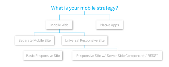
Below is a diagram that shows the three main approaches as a decision tree. You may find yourself ending up at many points on this tree (like Yelp!) or just one (like Starbucks). There seems to be an emerging pattern to design a responsive mobile site for phones and tablets, then split off the desktop experience. At Hot, we’ve discussed a hybrid approach in which 80% of the site is a universal responsive site and you optimize around 20% of the pages.
This post is courtesy of Hot Studio where it originally appeared on October 5, 2012.
 MARSHA PLAT
Leave a comment